Tuesday, August 19, 2014

Soft Proofing #2 - Testing Update

The prints have been delivered and an initial inspection has highlighted several points:


  1. The photos need to be brightened even more, although not by much.
  2. With the photos using the "Perceptual" rendering intent the reds seem to be more orange than red.
  3. Not sure whether it is my eyesight or the ambient light but the border of the photos were the ICC Profile is applied appear to have a very slight colour cast.


Overall I am at present leaning towards using the ICC Profile with the "Relative Colorimetric" rendering intent plus Photoshop adjustments, although further examination is required especially under different lighting conditions.  I will probably make some further adjustments, especially on the brightness, and re-submit them for printing.

Friday, August 15, 2014

Soft Proofing #2 - Testing

Following on from my post (http://iam-photos.blogspot.co.uk/2014/08/soft-proofing-1.html) about ICC profiles and soft proofing,  plus the research that took place, I decided to do some testing and see how my existing workflow might need to be changed.
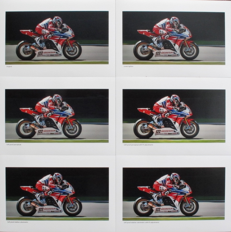
In total I prepared 6 versions of the some image, with 2 versions having the soft proofing techniques detailed by Sean Bagshaw (https://www.youtube.com/watch?v=ND_GzCueX4s) being applied to them.  The purpose of this testing is to try and find a suitable workflow within Photoshop for creating JPEGs that produce prints that are as close as possible to their on-screen version.

Version 1: This is the original image.  No additional adjustments have been made.
IMG_0733
Version 2: A "Levels" adjustment layer applied to brighten the image.  This tends to be needed as the brightness of monitors is normally higher than the resulting printed version.
Levels
Input Levels (0.85), Blend mode (Screen), Opacity (20%)
IMG_0733 levels lighten
Version 3: Version 2 with the "DS Colour Frontier for Lustre" ICC Profile applied using the "Perceptual" rendering intent.  No additional adjustments have been made.
IMG_0733 soft proof perceptual
Version 4: Version 2 with the "DS Colour Frontier for Lustre" ICC Profile applied using the "Relative Colorimetric" rendering 
intent.  No additional adjustments have been made.
IMG_0733 soft proof relative colorimetric
Rendering Intent. This simulates how colors will be compressed when they are converted into the printer color space, and is the single most influentual control over how image colors are printed. If this option isn't available, relative colorimetric is usually the default. For more, see the tutorial on color space conversion (http://www.cambridgeincolour.com/tutorials/color-space-conversion.htm).  Ref: http://www.cambridgeincolour.com/tutorials/soft-proofing.htm
Version 5: Version 3 with additional adjustments using Sean Bagshaw's techniques.
Levels
Input Levels (0.85), Blend mode (Screen), Opacity (20%)
Curvesimage
Hue/Saturation
Saturation (+10)
Photo Filter
Filter (Warm Filter (85)), Density (25%), Blend mode (Normal), Opacity (25%)
IMG_0733 soft proof perceptual with PSD adj
Version 6: Version 4 with additional adjustments using Sean Bagshaw's techniques.
Levels
Input Levels (1.00), Blend mode (Screen), Opacity (20%)
Curvesimage
Hue/Saturation
Saturation (+10), Lightness (-5)
Photo Filter
Filter (Warm Filter (85)), Density (25%), Blend mode (Normal), Opacity (25%)
IMG_0733 soft proof relative colorimetric with PSD adj
Further information: My current workflow involves using Lightroom to export the adjusted PSD files as JPEGs but whilst creating these test images I discovered a couple of issues.
  1. Doing just a straight export overrides the colour profile from the ICC Profile set within the PSD to sRGB.
  2. At the export stage if you manually change the colour profile to the required ICC Profile it exports the image with a rendering intent of "Perceptual".  There is no option to change it to "Relative Colorimetric".
This means that to get a JPEG with the required rendering intent you must first create a virtual soft proof copy via Lightroom’s Develop module and export this virtual copy.  I have been using Lightroom to create my JPEGs as it automatically adds them to the catalogue but now it looks as though I will have to create the JPEGs using Photoshop and then afterwards manually import them into my Lightroom catalogue.
The JPEGs have been sent off to DS Colour Labs for processing, and once I get the prints back I will report on the results.

Thursday, August 07, 2014

Soft Proofing #1

Last year I decided that rather than entering the DPI (digital projected image) competitions at my local photography club I would enter prints.

My workflow for producing the prints was:

  1. Prepare image within Photoshop
    1. Resize the image
    2. Brighten the image by +10 using a Brightness/Contrast adjustment layer
    3. Resize the canvas (4800 x 3600 for 16" x 12", 3600 x 2400 for 12" x 8")
    4. Save as a .PSD file
  2. Use Lightroom to export the PSD as a JPEG
  3. Send the image (JPEG file) off to be printed
  4. Once delivered mount the printed image

The company I use to print my images is DS Colour Labs Ltd (www.dscolourlabs.co.uk), and have always been very pleased with the results.  Although the friend who recommend DS Colour Labs has recently experienced an issue with them, in that his printed images were coming back a lot darker than expected.  After talking to DS Colour Labs tech support they advised him to use their supplied ICC profiles.  This led me to thinking that I should be using the ICC profiles and also the whole aspect of soft proofing images before sending them off for printing.

Soft proofing is the ability to view a simulation of how your image will look when out- put to the printer on your monitor, based on the chosen profile.  Ref:  http://www.udel.edu/cookbook/scan-print/softproof/sofftproof.pdf

There is a lot of information available on the Net about soft proofing within Photoshop and Lightroom, telling you how to use ICC profiles and the soft proofing facilities in the applications.  But what a majority don't discuss is how best to adjust your images whilst soft proofing them.  One good resource that I did come across is Sean Bagshaw's YouTube video "Build A Photoshop Action For Soft Proofing" (https://www.youtube.com/watch?v=ND_GzCueX4s)  What this has done is made me re-evaluate my work flow and I am currently in the processes of testing different options.  Once the testing is complete I will give an update.

Tuesday, June 24, 2014

From That To This – Luminosity Masks

IMG_0041 42 43 lm exp 01 (no lr adj)-t2t

Introduction

Recently I came across the concept of Luminosity Masks and using them to blend multiple exposures via a tutorial “The Basics Of Luminosity Masks In Digital Blending” by the travel photographer Jimmy McIntyre.  The tutorial also includes a link Jimmy’s Photoshop action set for creating luminosity masks.

After a number of failed attempts in trying to both understand and utilise luminosity masks I decided to go back to basics by using what I perceived to be a very simple image.

I am by by no means an expert with luminosity masks, but thought it might be a good idea to document my progress so far.  There are a number of excellent tutorials available, which I have referenced at the bottom of this post.

Images

4 photos of some rooftops and the sky, with each one at a different exposure (-1, 0, +1, +2)

IMG_0041 42 43 lm exp 01 (no lr adj)-t2t - 2

Photoshop

  1. Load the images into Photoshop as layers ordered as 0, –1, +1, +2, and turn off the layer visibility for –1, +1 and +2.
  2. Now create the luminosity masks by running the Luminosity Masks from Jimmy McIntyre’s “Easy Panel”.  If you look at the Channels panel you will see 18 additional channels:  Brights 1 – Brights 6, Darks 1 – Darks 6, and Midtones 1 – Midtones 6

    IMG_0041 42 43 lm exp 01 (no lr adj)-t2t - 3
  3. First lets work on the lower part of the image, the rooftops and the walls.  This needs to be brightened so duplicate the +1 layer and add an inverted mask.
  4. Now we need to choose an appropriate luminosity mask to use.  For the rooftops we are interested in one of the Darks, as we don’t want the sky brightened.  Go to the Channels panel and click on the thumbnail of one of the Darks channels’.
    IMG_0041 42 43 lm exp 01 (no lr adj)-t2t - 4
  5. Once you have decided upon the channel to use (I am used Darks 3) hold the Ctril key and click on the thumbnail.  Marching ants will now appear around the selection (the white areas, these being the dark tones, in this case elements of the rooftop and not the sky).  Click on the RGB thumbnail to bring back the colour and also see the marching ants more clearly.
    IMG_0041 42 43 lm exp 01 (no lr adj)-t2t - 5
  6. Go to the layers panel, select the inverted mask of the duplicated +1 exposure layer (see step 3), select a feathered brush with white foreground and 100% opacity, and paint over the rooftops and walls to reveal the bright areas from the duplicated +1 exposure layer (you can hide the marching ants if they are distracting by pressing Ctrl + H).  See the before and after below:
    IMG_0041 42 43 lm exp 01 (no lr adj)-t2t - 6
  7. Now repeat steps 3 – 6 for each combination of area and level of exposure you want to blend in.  For example I used multiple copies of the –1 layer with various luminosity masks, both Darks and Brights, to not only darken the sky but to bring out the detail in the clouds.
    IMG_0041 42 43 lm exp 01 (no lr adj)-t2t - 7
  8. The problem is that the image still looks a bit flat, but we can also use the luminosity masks to adjust the contrast.
  9. Go to the Channels panel and Ctrl + Click on the Midtones 3 thumbnail, then go to the Adjustments panel and create a Curves Adjustment Layer.  At the same time a layer mask will be created based on the selected Midtones 3 luminosity mask from the Channels panel
    IMG_0041 42 43 lm exp 01 (no lr adj)-t2t - 8
  10. Adjust the Curve to taste.
    IMG_0041 42 43 lm exp 01 (no lr adj)-t2t - 9
  11. Repeat steps 9 – 10 for any other areas were you want to adjust the contrast.
    IMG_0041 42 43 lm exp 01 (no lr adj)-t2t - 10

Final Image

IMG_0041 42 43 lm exp 01 (no lr adj)

Further Tutorials

Wednesday, June 18, 2014

Pixelated Matrix

Michael Freeman is an award-winning editorial photographer and best-selling author, and since taking up photography I have read a number of his books.

Apart from being very informative, these books are a good read and they have helped me in gaining a better understanding of photography and how to take better photographs.

The book I am currently reading is:

Exposure is the deceptively simple concept at the very heart of photography.  It has always been a subject of fascination to aspiring amateurs and professional photographers alike.  Recent developments in digital technology have transformed the ways in which exposures can be manipulated, and this in turn has forced photographers to think about what they can achieve by understanding the variables of aperture, ISO and time.

One concept the book introduces is the Pixelated Matrix.  By reducing an image to it’s tonal distribution it is a way of seeing the important tones, but without the content interfering.  It makes it easier to consider any exposure issues (after the event).

IMG_0480-pixelate

To create a pixelated matrix in Photoshop do the following:

  1. Create a duplicate of the image
    Image | Duplicate…
  2. If the duplicate is made of multiple layers, flatten it
    Layer | Flatten Image
  3. Reduce the duplicate in size to 1,200 pixels on the long side
    Image | Image Size…
  4. Desaturate the duplicate
    Image | Adjustments | Desaturate
  5. Apply a mosaic filter to the duplicate with a cell size of 67
    Filter | Pixelate | Mosaic…
    Cell Size: 67

I plan on using this technique quite often in the future to assist in making sure that I am not loosing any detail in the shadows and highlights, an area that competition judges like to pick up on.

Monday, June 02, 2014

From That To This – Shane Byrne

IMG_8820-t2t

Introduction

3 times British Superbike champion Shane Byrne came second in 2013 and is the favourite to win the championship in 2014.  The photograph was taken at Brands Hatch during free practice 2, the day before the first race of the season.

IMG_8820-21/500th; f/8; ISO 400

Lightroom

  1. Crop the image to remove the advertising hoarding (top left), rumble strip (bottom) and the patch of green (right).

    IMG_8820-3
  2. With the Basic panel adjust make the following adjustments:

    Exposure (+0.20), Contrast (+10)

    Highlights (-100), Shadows (+75), Whites (+36), Blacks (-10)

    Clarity (+30), Vibrance (+20), Saturation (-5)

  3. With the Detail panel adjust the Sharpening and Noise Reduction:

    Sharpening Noise Reduction
    Amount: 70 Luminance: 40
    Masking: 74 Contrast: 10

  4. Add a vignette using the Effects panel:

    Amount (-15), Midpoint (45)

  5. Using the Spot Removal (Heal) brush remove any spots or marks:

    IMG_8820-t2t - 1
    The “before” image highlights the marks that will be removed.

  6. Finally using the Adjustment Brush, with the Exposure set to +0.50, brush over the bike and it’s direction of travel.  This will help concentrate the eye on the bike and assist in emphasising the movement:

    IMG_8820-t2t - 2

Final Image

IMG_8820

Saturday, May 24, 2014

From That To This – Josh Brookes

IMG_8798-t2t

Introduction

Josh Brookes, having moved from Tyco Suzuki to Milwaukee Yamaha, is one of the main contenders for 2014 British Superbikes championship.

The photograph was taken at Brands Hatch during free practice 2, the day before the first race of the season.  As we can see it is rather over exposed with a far bit of clipping.

IMG_87981/320th; f/8; ISO 400

Lightroom

  1. Although there is plenty of motion, it can be emphasised even more with a bit of cropping and angle adjustment:

    IMG_8798-3
  2. With the Basic panel adjust the exposure and colour.

    First set the white balance.  Using the White Balance Selector click on a grey part of the track.

    Next drop the Exposure to –0.70 to reduce the clipping yet not make the photo to dark.  Increase the Contrast to +10.

    Decrease the Higlights to –100 and increase the Shadows to +100.  This helps reduce the clipping even further but bring out detail from the shadow areas.

    WARNING!  Opening the Shadows right up can make whites look false, so you might need to drop them back down a bit (i.e. +75).

    Adjust the Clarity (+41), Vibrance (+21) and Saturation (+5) to taste.

    Now adjust the Whites (+14) and Blacks (-12) to values just as clipping starts.  The best way to do this is to press the Alt key whilst adjusting the slider.  The photo will masked as a solid colour (i.e. black whilst adjusting the Whites) and clippings will appear as the opposite colour (i.e. white).

    IMG_8798-t2t - 1
  3. At the bottom left-hand corner of the photo is some white.  This can be removed using the Spot Removal tool.
  4. With the Detail panel adjust the Sharpening and Noise Reduction:

    Sharpening Noise Reduction
    Amount: 70 Luminance: 30
    Masking: 60 Contrast: 5

  5. Finally, using the Effects panel add a Post-Crop Vignette:

    Amount: -14 Midpoint: 45

Final Image

IMG_8798-2